Poster presentation guidelines
Presenting a poster at EMAC2016
Poster track chair: Matilda Dorotic (BI Norwegian Business School).
At the conference, there will be one poster session, on Thursday May 26, 2016 at 17:30 – 19:00, immediately following the keynote session.
Your poster presentation
Posters will be grouped by tracks, or by clusters of tracks. Track chairs and session chairs are invited to comment on the posters. At least one of the authors must be present during the session, and be ready to interact with attendees while standing close to their poster presentation. If one author represents a team that wrote the paper, that person should be capable of responding to questions concerning all aspects of the presented research. A poster is a highly respectable way to present your research, and the main medium at conferences in most disciplines. You should aim to use the poster as a means for generating active discussion of the research. It is helpful if poster presenters bring handouts or printed copies of the working paper to distribute among interested poster visitors. BI Norwegian Business School has sufficient print-and-copy facilities where you can print these materials, but we encourage presenters to prepare the material in advance. Before the poster session, do prepare and rehearse a brief summary talk on your project. Many viewers will be in a hurry and will want a quick "guided tour" of your poster, so make sure you are able to clearly state the purpose and findings of your research in just couple of sentences that are able to grab attention. Do not be afraid to point out uncertainties in your work; this is where you may get useful feedback. Your 100-word abstract will be published in the EMAC Proceedings.
Support:
You will get the assistance of ‘poster buddies’ who will bring appropriate materials to affix your poster to the poster boards. There is no need to bring your own adhesives. EMAC support teams which will be clearly visible (in EMAC shirts), together with the poster track chair(s) will be at your disposal in case you have further questions (regarding the technical queries).
Format:
The poster size should be A0 portrait format (width 841mm and height 1189mm). Our poster boards cannot accommodate larger posters, or posters in landscape format. We kindly ask you NOT to laminate your poster with plastic. Laminated posters tend to curl and are difficult to affix to the boards.
Design and layout specifications
Keep in mind that a poster is a graphical approach to presenting research.
- You can attract attention with a good topic and a visually appealing presentation. Organization and clarity are critical. Limit the text to one fourth of the poster space, and mainly rely on "visuals" (graphs, photographs, flowcharts, etc.) to tell your "story".
- Your poster title and author information should be positioned at the top-center of the poster. Font size for the title should be at least 70 points, for author information at least 30 points. Use all capital letters for the title.
- Make it obvious to the viewer how to navigate the poster. The poster generally should read from left to right, and top to bottom. Numbering individual panels, or connecting them with arrows is a standard "guidance system".
- Leave some open space in the design. An open layout is less tiring to the eye and mind.
- Text should be readable from 1.50 meters distance. Use a minimum font size of 24 points.
Visuals
Present numerical data in the form of graphs, rather than tables. Graphs make relationships between variables or differences between means much more evident. If data must be presented in table-form, KEEP IT SIMPLE.
Text
- Visuals should be simple. Leave out or remove any unnecessary details.
- Make sure that any visual can "stand alone" (i.e., graph axes are properly labeled, symbols are explained, etc.).
- Use color to enhance comprehension, not to decorate the poster.
- Make sure that the text and the visuals are integrated. Figures should be numbered consecutively according to the order in which they are first mentioned in the text. Each visual should have a brief title.
If you have any remaining questions about poster presentations, please contact the EMAC2016 Poster Track Chair Matilda Dorotic at matilda.dorotic@bi.no.
Posters - mounting and dismounting
Posters may be mounted on Thursday, May 26, between 08:00-12:00. Please locate your poster number on the poster wall. All numbers can be found in the poster list included in the conference program book.
Materials for mounting the posters will be offered next to the poster walls by the conference organizers. Our staff members will be positioned close to the poster walls and will be happy to assist you with mounting your poster. We are using velcro tape "dots" to mount the posters onto the poster walls. The use of pins, tape, etc. are not allowed.
All posters must be removed immediately after the poster session has finished.
Any posters still hanging after 10:00, Friday May 27, will be removed and disposed of by the conference organizers.
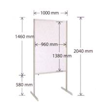
The poster walls are covered with grey fabric. Measures are as shown below. Please mount one poster per poster wall. Please make sure your poster adheres to the given measures.

- Use text to (a) introduce the study: What hypothesis was tested or what problem was investigated? Why was the study worth doing?, (b) explain visuals and direct viewer attention to relevant data and relationships portrayed in the visuals, and (c) state and explain the interpretations that follow from the data. In many cases, conclusions can be summarized in a bullet-point list.
- Add key references to the paper, but do not exaggerate. References should be formatted according to the guidelines in the paper submission guidelines.
